Choosing colours for projects can be a tricky business. For some, deliberating over the right shade can take hours or even days. For others, the process can be instant – they seem to have a built-in colour magnet that guides them.
If you are the former type, you will want to read on to see how you can build your colour skills. Here’s what this post covers:
- basic theory of using colours
- using a colour wheel
- where to look for colour inspiration
- helpful online tools for colour choices
- my favourite books for colour inspiration
- tips on choosing colour
Basic Colour Theory
In the main, colours can be split into four categories:
Primary Colours
Primary colours are red, yellow and blue, these are pigment colours that cannot be made by mixing other colours together. They are the building blocks for colour development because all other colours are built on their foundations.
Secondary Colours
Secondary colours are green, orange and purple and are gained by mixing equal amounts of two primary colours together. These are located between primary colours on the colour wheel.
Red + Blue = Purple
Yellow + Blue =Green
Red + Yellow = Orange

Tertiary Colours
Tertiary colours are yellow-orange, red-orange, red-purple, blue-purple, blue-green and yellow-green. These are made by mixing a primary and secondary colour together. These are located between the primary and secondary colours on the colour wheel.
Adding white to a colour gives you a tint, adding black creates a shade and adding grey makes a tone.
Let’s not forget the importance of Neutrals
What you don’t tend to see on the colour wheel are the neutral tones. Given that these are some of my favourite colours, I want to make sure they are represented here too.
Pure neutrals are considered to be black, white and grey. Other neutrals can be created by mixing two complimentary colours or by mixing a colour with white, black or grey to create near neutrals such as browns and tans.
Think of all those glorious undyed neutrals of sheep fleece and wool. Hmmmmmm, delightful, understated colours that stand on their own and really help to transition bright, poppy colours together.
Natural Sheep Colours
Did you know that the Shetland sheep breed has 11 different recognised fleece colours!
Using a Colour Wheel
One of the easiest ways to choose colour is to have a 12-part colour wheel in front of you.
Complementary Colours
For a simple two-colour option, choose colours that are directly opposite each other in the colour wheel. Combinations such as orange and blue or red and green give colour contrast which is attention grabbing, pleasing to the eye and often seen I nature.
Analagous Colours
This is an easy way to choose three colours for a project. Choose any three colours that sit side by side on the colour wheel. Their proximity to each other means that they flatter each other and are an easy choice. This option could be yellow/ yellow-green/ yellow-orange. If you chose a primary colour as one of your analogous colours, this will usually dominate your other colours. For a more harmonious look, choose three colours between the primary colours such as yellow-orange/orange/ red-orange.
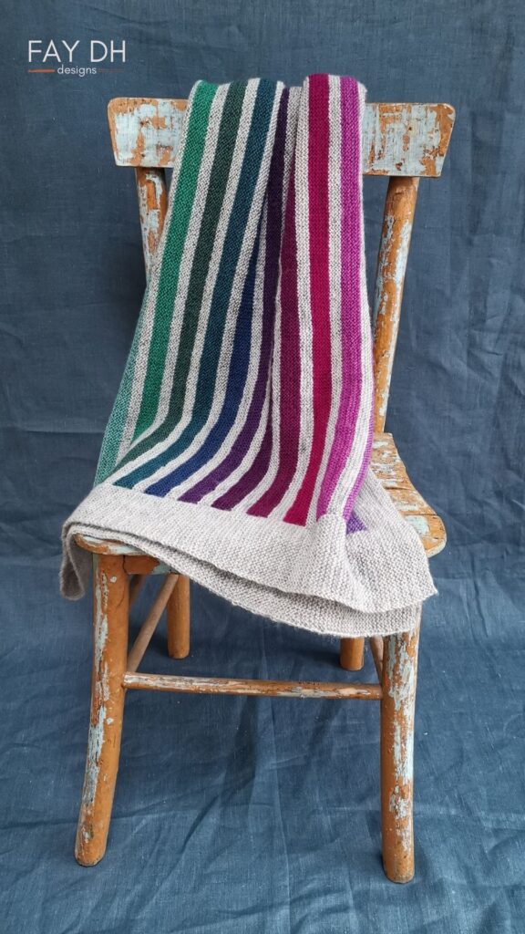
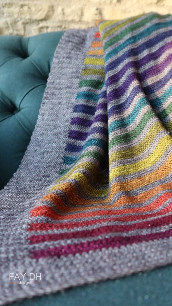
If you need more colours, try choosing complimentary colours and their analogous colours. Below are examples of this in my Scottish Rainbow (knitted) and Stormy Rainbow (crocheted) blanket patterns that pleasingly work through colours, using a neutral grey to bring them together.
Monochromatic Colours
To my mind, this is the easiest option of all to choose a colour scheme because you only actually need to choose one colour and then add different variations of that colour. John Arbon Textiles does this brilliantly in their Knit By Numbers range which starts with one darker colour and creates tints of that colour by blending more white fibre to create a monochromatic scale of each colour over 6 tints. Monochromatic colour usage is very harmonious and pleasing to the eye.
Colour Wheel Resources
Dream Home Decorating has colour wheels that you can download for free.
You can also buy colour wheels online, just search for something like “essential colour wheel with tints and shades”.
Tip on Checking Colour Values
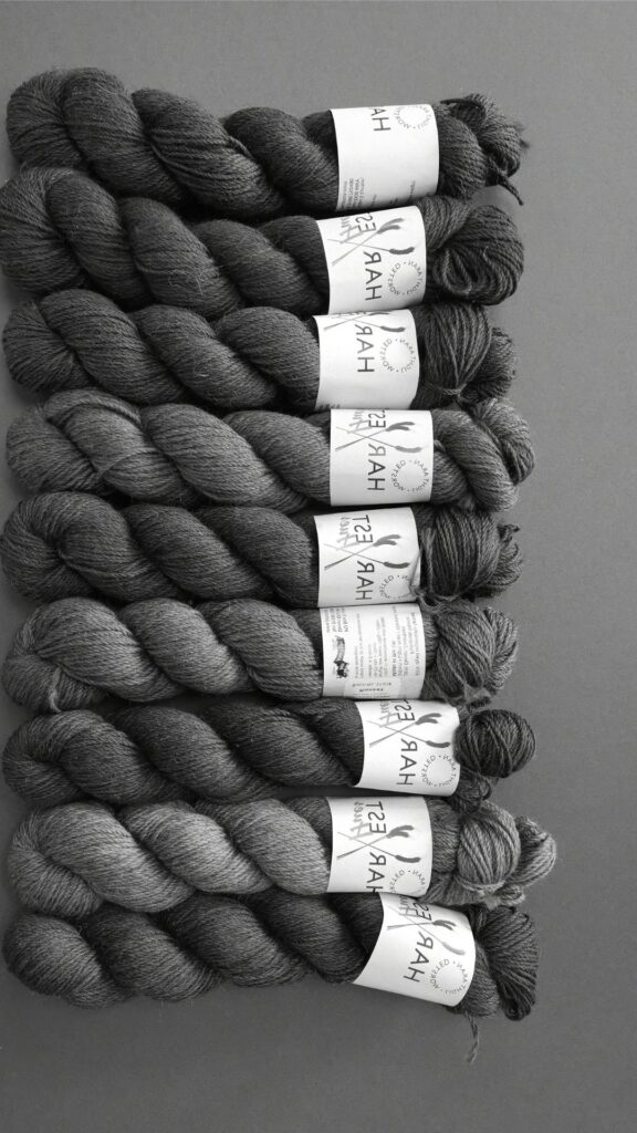
Finally, I would also recommend taking a black and white photo (in mono) of your yarn choices. This allows you to see your choices without hue or saturation or colour, just the pure colour values. Tien Chiu has a great blog post for this with supporting videos. She also has a newsletter where she talks about colour for weaving.
This is a particularly helpful technique of you are undertaking colour-work projects such as Fair Isle knitting or Mosaic Crochet.
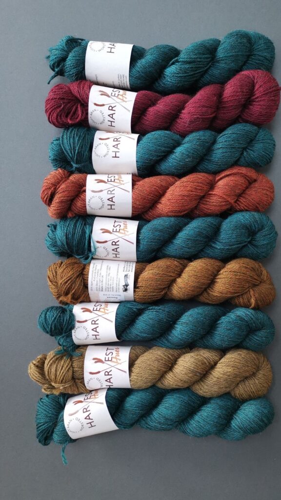
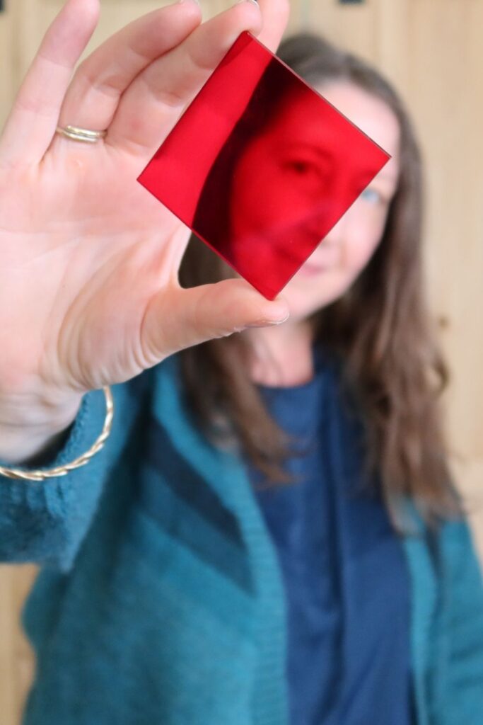
I recently came across another way of quickly checking colour values without having to take photos. A sheet of red perspex can be laid on top of your yarn choices to show off the shade values. Let me show you:
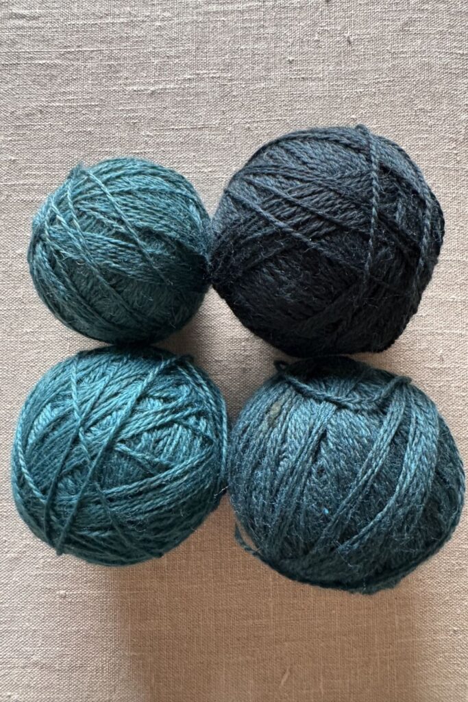
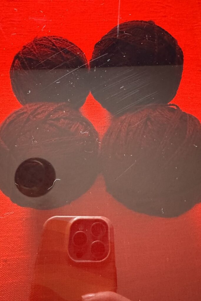
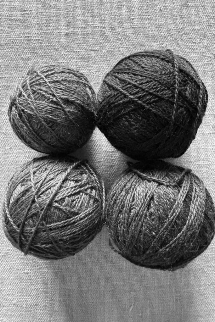
The bottom two images show the same four balls of teal yarn under red perspex and as a monochrome photo. Both clearly show that the top left and bottom right balls of teal yarn are very close in shade value and will have very little distinction within a crafting project.
For me, using a sheet of red perspex when I am choosing complimentary shade values within yarn colours is so much quicker than taking photos. I can easily swap out skeins and compare see the results as I do so.
My little square of red perspex was part of a colour wheel kit that I bought in Hobbycraft. The A4 sheet I also use came from eBay as a general search for “A4 red perspex/ acrylic 3mm”. You don’t want the sheet to be more than 5mm deep so that you can still see through it.
Look for Colour Inspiration
I truly believe that you can get better at combining colours and build your colour muscles. Understanding the basics set out above is a good place to start. That then allows you to start looking at the colourful world around you to see what is harmonious, what clashes, what you are drawn to?
Earthy, muddy tones always excite me. I am drawn to nature, natural textures and colours and this is very evident through my crochet and knitwear designs. I don’t always stick to these earthy tones but they are the ones I enjoy working with most. Given how long it takes to crochet, knit, weave or spin something, I want to derive maximum enjoyment from that, and so colour choice is high up on my agenda.
If the idea of looking at the world for colour inspiration is new to you, try taking photos of the colours that you are drawn to. I have hundreds, possibly thousands of photos on my phone of colour combinations I have seen in my garden, in cityscapes, at the beach, in architecture. Opening up to this way of looking and recording colour gives inspiration when I need it.
Here are a just a few of the snaps from my phone (I have hundreds). It’s also interesting to look at photos in minutia. There are so many colours in a photo, why not try looking at the colours in just a small part of that photo?

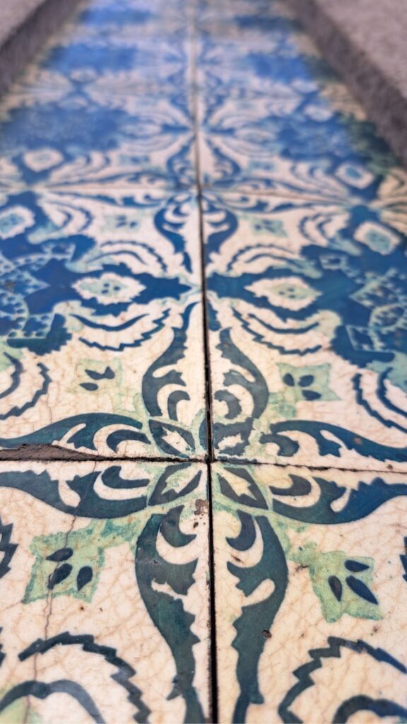
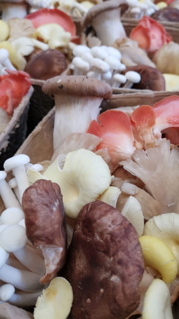

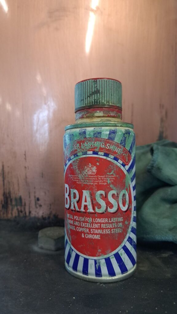

Other places for colour inspiration can be found in all sorts of places beyond looking at architecture and nature, but particularly in other crafts where specific combinations have already been chosen.
Colour in Art and Crafting
Althea McNish
Althea was was one of the best textile artists in the UK during the mid-20th Century, always bringing her Trinidadian colour palette to her colour choices. Many of her fabrics are bold, bright and contrasting and have definitely made me rethink my love of earthy yarn choices.
Here are some photos of her work from the ‘Colour Is Mine’ exhibition I attended at the Whitworth Gallery in Manchester in 2023.
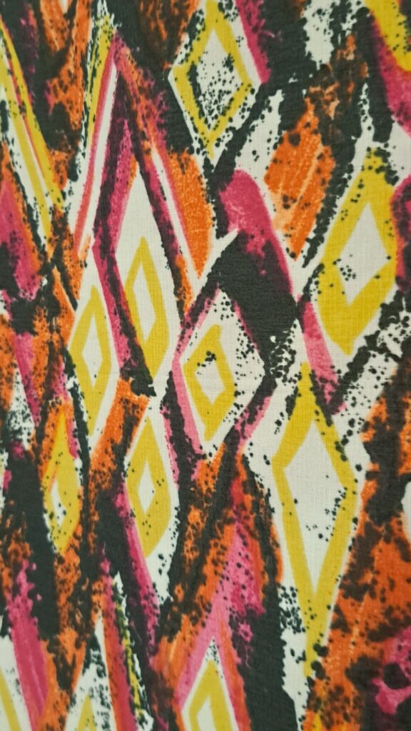
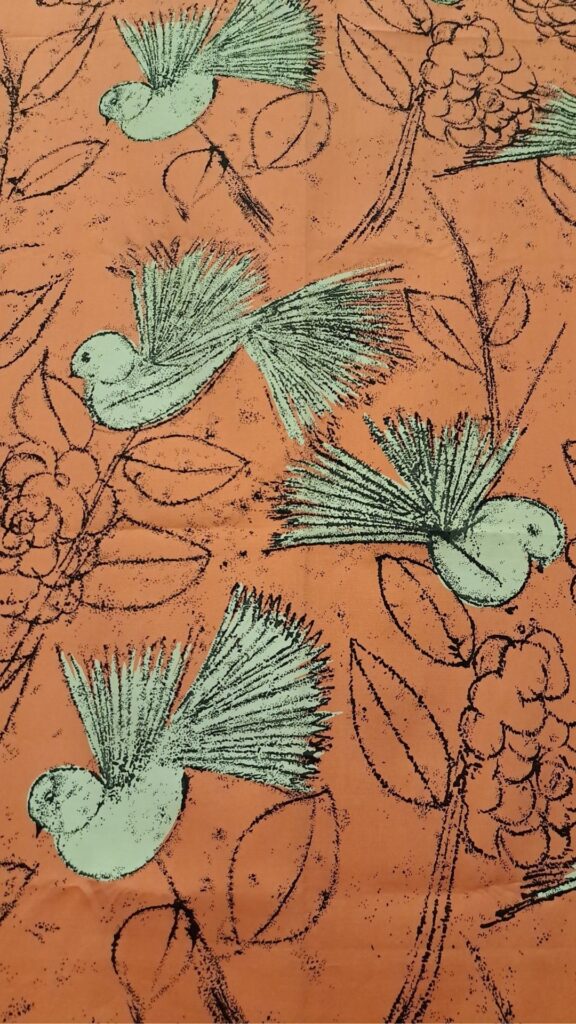
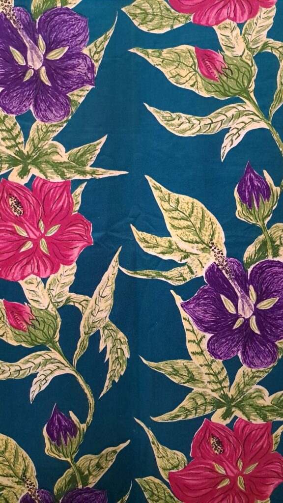
The V&A Museum website has some more details on Althea and photos of her incredible textiles. I also found this PDF in case you want to learn more about Althea and her work.
Patchwork Quilts
Look to other crafts such as patchwork quilting to see how colours are combined. I love these ones which show fabrics used over many generations to create functional quilts that were made from scraps to cover windows, walls and floors to keep the inhabitants of Gee’s Bend warm in their cabins.
Take to the Internet
A simple Pinterest or web image search for “patchwork quilts” will bring thousands of colour combination ideas straight to your computer screen.
Fashion
Fashion old and new can be a great source for colour inspiration. I visited an exhibition in Hawick, a Scottish Border town. It was called ‘Colour, Texture & Destination’: An exhibition celebrating the creative and cultural legacy of Bernat Klein.
Whilst Klein was a true innovator for knitwear and woven cloth, it was actually the colour palettes that the Fashion Communication and Design for Textiles students had pulled together based on his work that I found more interesting. I photographed most of their mood boards for future colour combination ideas. Colour inspiration is literally everywhere!
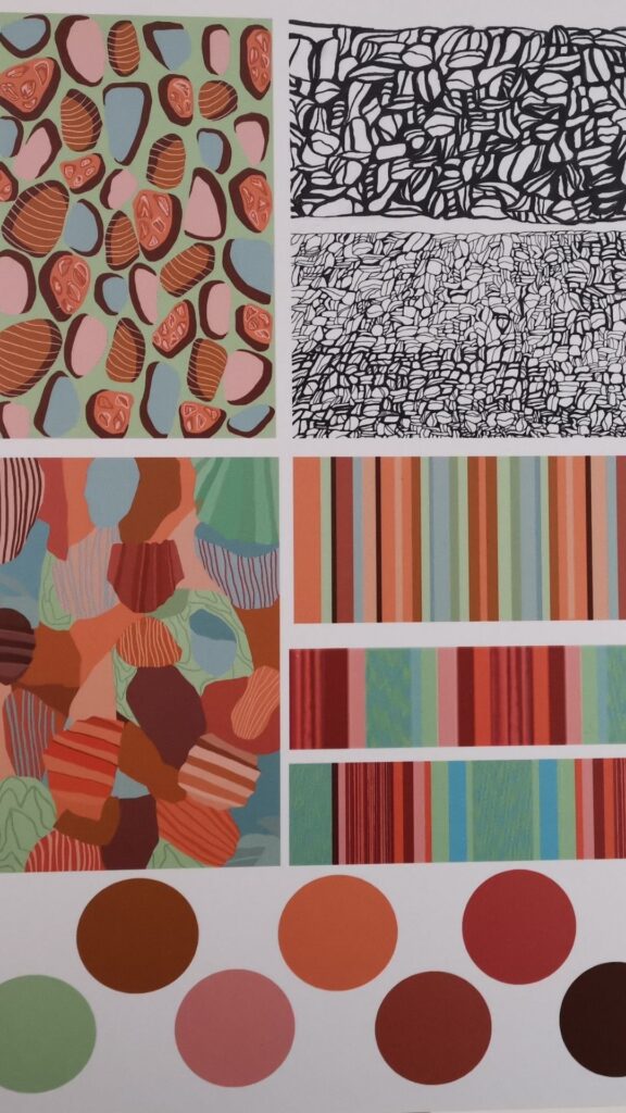
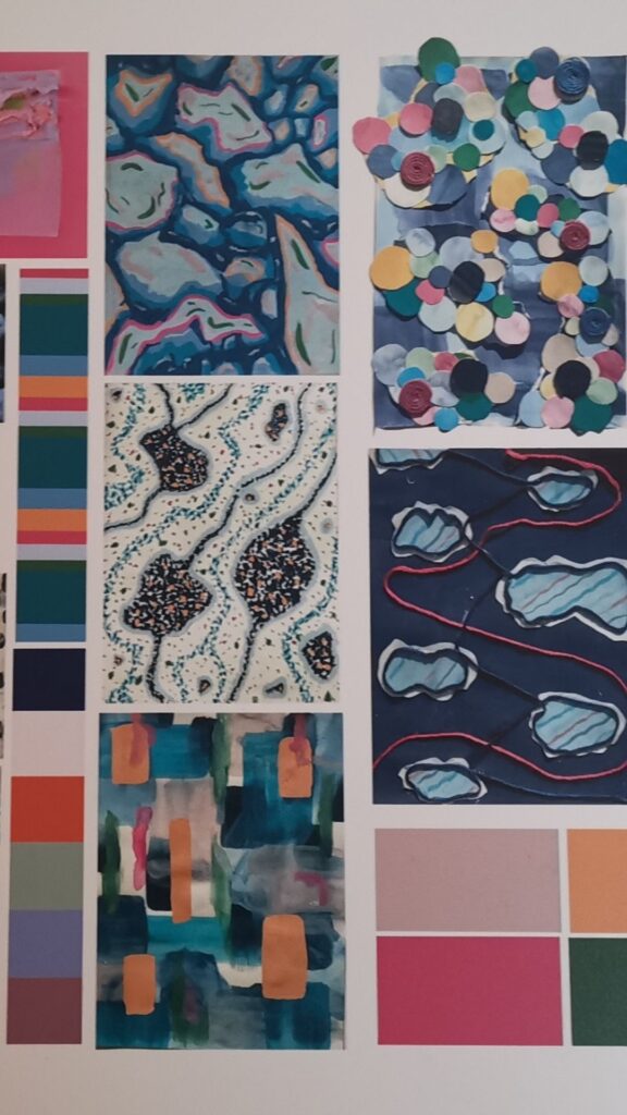
I often dip into the latest catwalk shows to see which colours are going to be popular in the coming years – it generally takes 2 or more years for the catwalk colours and textures to filter down to become mainstream in the hand knit and crochet space.
I am far from being a follower of fashion, but as a designer, it’s interesting to see which colours are going to be popular and to see how colours are being used in textiles.
Search Hashtags
Another rabbit hole you can fall down is to follow colour specific hashtags on Instagram. I cannot be held responsible for the amount of time you spend looking that these hashtags!
- #coloursofnature #colorsofnature
- #coloursofindia #colorsofindia
- #coloursoftherainbow #colorsoftherainbow
- #coloursofautumn #colorsofautumn
- #coloursoflife #colorsoflife
- #coloursofdecay #colorsofdecay
- #coloursofthesky #colorsofthesky
- #coloursoftheworld #colorsoftheworld
- #coloursofspring #colorsofspring
- #coloursofbritain
If you are making a pattern that has been made before, check the hashtags to look at the colour combinations that others have used. People are generally quite good at giving details of the yarn they have used, so it can be easy to replicate their yarn choice, or take to the web to find a yarn alternative in similar colours.
Online Tools for Choosing Colours
Colour Choice Options
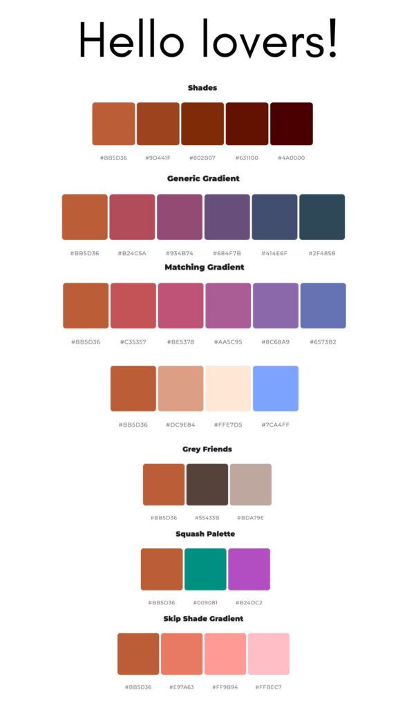
Color Space is an amazing website where you can choose what your main/ dominant colour is likely to be and the website gives you a number of colour combinations. You can either choose the colour on screen, or enter a hex code for that colour. The website then shows you 25 different colour combinations with 3 – 6 different colours options.
If you want to get really specific, there is a phone app called Color Grab that you can use to point at your yarn and it will tell you what the hex code is. You can then feed that into the My Color Space website! Again, I cannot be held responsible for the hours you may spend down this rabbit hole!
Here is what Color Space gave me when I entered the hex code for one of my brand colours (the rust colour). Some of the combinations are right up my street and others can get in the bin as far as I am concerned.

My favourite Books for Colour Inspiration
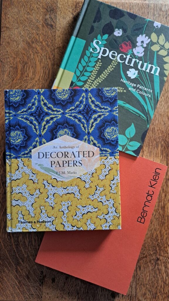
I have some key books that I flick through when I am lacking colour or design inspiration. All of them are still in print, so here are the details in case you fancy them too:
- Spectrum – Heritage Patterns and Colours by the V&A shows 115 images of textiles and wallpapers from 1400 to 2009. What really makes it stand out is that the colours of each image have been picked out and their CMYK colours are given. Published by Thames Hudson in 2018. ISBN 978-0-500-48026-7
- An Anthology of Decorated Papers by P.J.M Marks has 249 pages of decorated paper images with all sorts of colour and print combinations to sift through. Published by Thames Hudson in conjunction with the British Library in 2018. ISBN 978-0-500-29392-8
- I have just realised that both of the books above are by the same publisher. Having looked on their website I can confirm that I now want ALL of their books. They have a book dedicated to pebbles and I think I need it!
- Bernat Klein by Mary Schoeser and Alison Harley shows how Klein pulled together fashion collections and has some excellent photos of his woven fabrics which had the most amazing colour combinations. Published by the Bernat Klein Foundation in 2022. ISBN 978-1-3999-3059-8
10 Tips for Making Colour Choices
Tip 1
The proportion of colours you add to a yarn project will directly impact on your finished object and how dominant a colour appears. Think about whether you want the colour that uses the most yarn to be your dominant colour of if you want it to pop out because it is less apparent.
Tip 2
It is also worth thinking about how the finished item will be worn. If it is a shawl, you may want the dominant colour where the shawl sits across your chest and will be seen most, rather than what seems dominant when the shawl is lying flat.
Tip 3
What if your favourite colour doesn’t look great next to the skin tone of your face? Avoid using it for hats, jumpers, shawls etc and use it for skirts, gloves and socks instead. You can still use the colour, just be more aware of where you use it.
Tip 4
If you are buying yarns to get a very specific colour combination, going to a yarn shop or yarn show will always be your best option for colour accuracy but that isn’t possible for everyone. Computer screen colours often don’t match the yarn in reality, so use your newest screen tech for making colour choices – you probably update your phone or a tablet more often than a laptop or desktop computer.
Another option is to see whether you can buy shade cards so that you always have a colour reference for favourite yarn brands. It’s also useful to keep little nuggets of yarn back to build up your own shade cards as a reference.
Tip 5
Always assess your colour choices in natural light. This is a great tip for yarns shops and yarn shows too. Ask to take the yarn to a natural light source before you purchase it. Strip lights are particularly awful for viewing colour under.

Tip 6
If you are buying yarn in a skein online, look closely at the photos that have the skein opened up. This will give you a better idea of all the colours in that skein. Yarn twisted into a skein could be hiding your least favourite colour. If you are looking to buy a skein at a show, ask the dyer whether you can open it out to check it. They should be happy for you to do so, but don’t be offended if they then take it back to re-skein it – dyers are very specific about the number of twists they put in their skeins!
Tip 7
If you are making an item for someone else, pay attention to what colours they already wear or have in their home. If they don’t live nearby, take a look at their social media accounts to see what colours they are wearing in photos. I know that making something for my best friend in bright pink or teal blue is a safe bet. I also know that there is no way she would wear my favoured sludgy/ earthy colours.
Tip 8
Look at your stash – is there yarn in there that you can use as a starting point to build more colours around? This could make it easier to then buy other complementary yarns for.
Tip 9
Using stash yarn also comes with a warning though! Some of the saddest projects I have ever made were because I was trying to shoehorn yarns together because I already owned them. I don’t wear or use them because I’m not in love wit the colour combination I forced upon myself.
Tip 10
Look up resources on wearing the suitable colours and remember that this changes with age. There are too many resources out there for me to choose from, I did discover that teal and aubergine work for every skin tone though.
Colour Conclusions
You don’t have to deep dive into colour theory to ‘get good’ at picking colours. By simply turning your colour-radar on, you will start to recognise the colours that light you up and the ones that you may choose to avoid.
Crocheting and knitting with yarns that bring you joy is essential as far as I am concerned. They make every stitch more delightful and mean that the finished object is more likely to be used.
If you were previously cautious about choosing colours, hopefully this blog post has helped to build your colour confidence? Or, at the very least, sign-posted you to ways that you can for your next project. I would love to hear you your experiences with colour, why not join me over on Instagram or leave a comment below?
Fay x
Other Posts You May Find Useful
Let’s Be Social
I am usually found in these online places, or you can join my newsletter where I talk about all things yarn, crochet and knitting:
- YouTube crafting podcast and crochet/ knit tutorials– @faydhdesigns
- Pinterest – FayDHDesigns
- Instagram – @faydhdesigns
- Newsletter sign up


